Branding
Guidelines.
Welcome to our hub for Handy Toyota branding guidelines and assets. We want to make it easy for you to create and develop marketing content while respecting our brand and Toyota Compliance.
Note that you can find Toyota’s branding guidelines here.
Our Logo
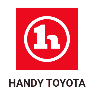
We take pride in our logo, and we require that you follow these guidelines to ensure that it always looks its best. Our logo is the combination of Toyota’s logo and Handy’s classic logo. This gives the logo an updated modern look and feel that aligns with Toyota.
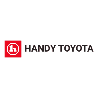
Horizontal Stack
Vertical Stack
Icon
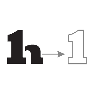
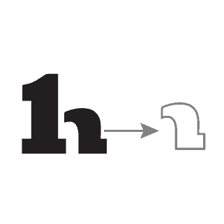
In cases when the Handy Toyota brand has already been established we simply use the icon on its own. While the icon can exist without the wordmark, the wordmark should never exist without the icon.
Basic Icon
Main Icon
Alternative Icon
Please note: The Basic Icon should only be used with Black and White.
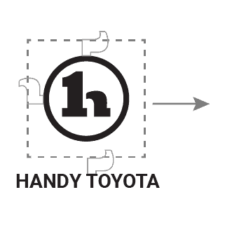
Exclusion Zone
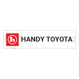
The exclusion zone is the white or negative space between two objects such as a logo and a paragraph or another image. Our exclusion zone is equal to the lengths as shown below.
Horizontal Stack Exclusion Zone
Vertical Stack Exclusion Zone
Minimum Size
Establishing a minimum size ensures that the logo impact and legibility is not compromised in application.
The Handy Toyota logo should never be smaller than 70px in digital or 20mm in print.
The Handy Toyota icon should never be smaller than 21px in digital or 6mm in print.
Logo Misuse
It is important that the appearance of the logo remains consistent. The logo should not be misinterpreted, modified, or added to. No attempt should be made to alter the logo in any way. Its orientation, colour and composition should remain as indicated in this document — there are no exceptions.
NO
Do not distort or warp the Logo in any way
NO
Do not use the word mark without the icon.
NO
Do not change the logo color or tone outside the Handy Primary Colors.
NO
Do not use gradients with the logo
NO
Do not outline or create a keyline around the logo
NO
Do not alter the typeface, nor recreate or manipulate wordmark or icon.
Our Colors
A brand’s colors play a huge role on how an audience perceives the brand. Handy Toyota’s primary color will always remain Toyota red. Red is associated with excitement, passion, energy, and action, which is exactly what we’re hoping to instill into our customers.
Toyota Red
R235 G10 B30
C00 Y100 M90 K00
Black
R00 G00 B00
C00 Y00 M00 K100
White
R255 G255 B255
C00 Y00 M00 K00
Grey
R204 G204 B203
C00 Y00 M00 K20
Please note: The Handy’s colors should only sit on black or white. Any other background color should use the other secondary colors of black, white, or grey.
Our Fonts
It’s not just what you say, it’s how you say it. A brand’s typeface can have a major impact on the way your brand communicates. Here are the fonts that we use everyday.
Roboto
ABCDEFGHIJKLMNOPQRSTUVWXYZ
abcdefghijklmnopqrstuvwxyz
123456789
Roboto Light
ABCDEFGHIJKLMNOPQRSTUVWXYZ
abcdefghijklmnopqrstuvwxyz
123456789
Roboto Bold
ABCDEFGHIJKLMNOPQRSTUVWXYZ
abcdefghijklmnopqrstuvwxyz
123456789